

When the U7 was completed in 1984, it was West Berlin’s longest underground line and the one with the greatest number of stations. Many of those stations, constructed at a time when the western half of the newly divided city was attempting to redefine its own urban identity, offered an extraordinary blank canvas for typographic invention. Today a journey in either direction from Mehringdamm – the spiritual, if not quite the literal centre of the line – provides not only a wonderful forensic history of how the line itself came into being, but also a voyage into the heart of a city that, in some sense, no longer exists.
The construction of the U7 has been recounted in detail elsewhere – the English or German Wikipedia pages are a decent-enough place to start, although you can also trace the evolution of the U-Bahn through old network maps at this page – but it is worth providing a brief summary. The first part of what would later become the U7 was initially constructed in the 1920s as a branch of the North-South Line (today’s U6); the branch, which ran from Hallesches Tor to Bergstraße (today’s Karl-Marx-Straße), opened in 1924 and was extended to Grenzallee in 1930. It was not until the mid-1960s that it became a line in its own right.
In 1966, the BVG (the Berliner Verkehrsbetriebe Gesellschaft, West Berlin’s transit authority) re-designated all the U-Bahn lines, replacing the old letters with a new system of numbers1. This coincided with the separation of the branch from its parent line and the first stage of a new westward extension from Mehringdamm. The U7 – or Linie 7 as it was then known – was officially born. Over the next eighteen years, the line was extended in both directions, a few new stations at a time. When it was finished, it was 32km in length and served some forty stations, including connections to all the other U-Bahn lines2. In the final years of the divided city, the U7 was the central artery of West Berlin.
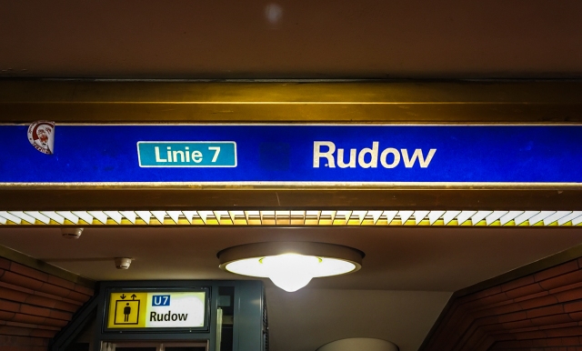
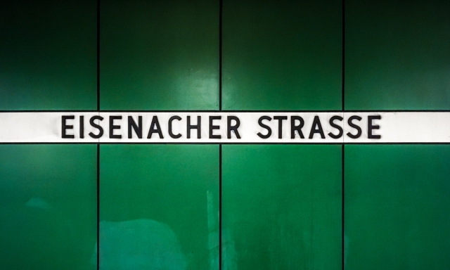
One of the few surviving signs that preserves the original name of the line.
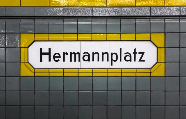
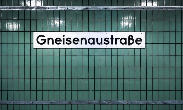
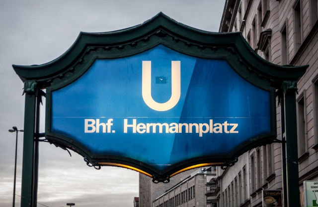
The phases of construction on the U7 are clearly visible from the station typography. In the oldest section of the line – between Mehringdamm and Grenzallee – there is a mix of styles and materials, from the painted tiles of Hermannplatz to the more recently modernised signs of Gneisenaustraße.
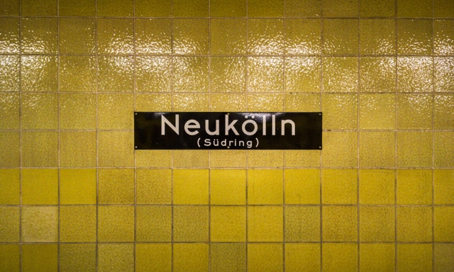
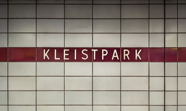
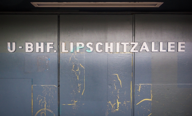
The name of the station is written across five separate tiles, making it easier to replace in the event of damage.
One of the few enamel plaques on the U7.
Arguably the most attractive Eszett on the entire U-Bahn network.
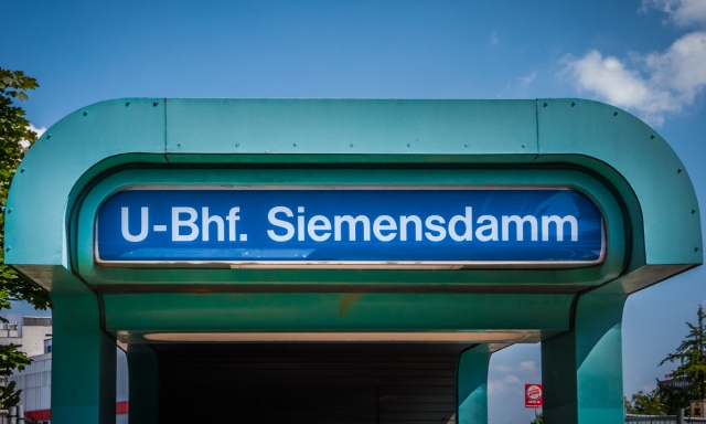
If you travel west from Mehringdamm, however, you encounter a series of stations (constructed between 1966–71) in which consistent typography is given variation by its setting within different coloured tiles or panels. The same style of station sign can also be spotted along the southeast end of the line, constructed at the same time.
This style of station sign also appears on platforms of the U6 and U9 constructed around the same time.
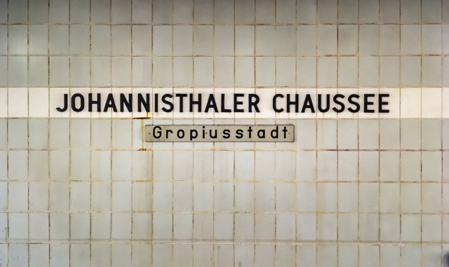
The unofficial station designation has been added below.
The letters are silver rather than black, but the face remains the same.
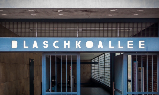
At Fehrbelliner Straße everything changes. The next several stations (constructed between 1971–78) are defined by functional and elegant Grotesk faces set against increasingly vivid tile-work. Unlike the capital letter signs of previous stations, the lower case makes a welcome return.
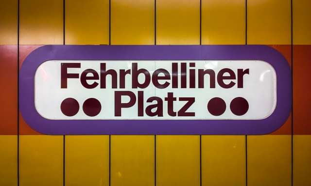
Rounded corners and large circles … welcome to the 1970s.
Yikes.
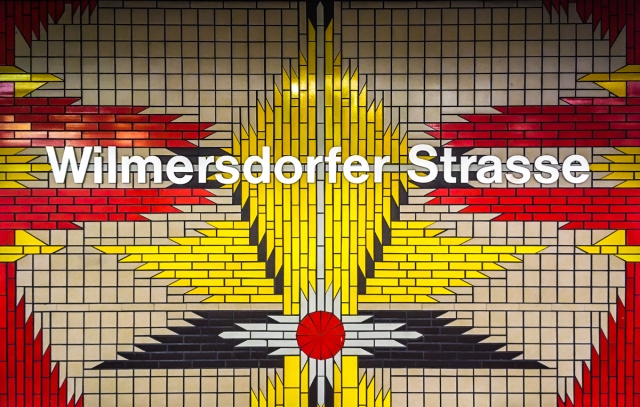
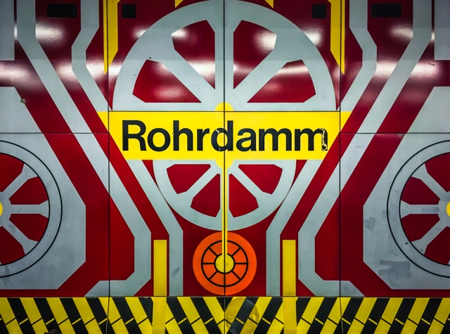
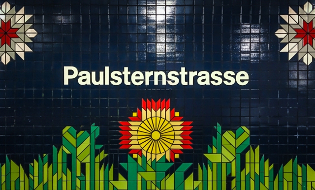
The section between Richard-Wagner-Platz and Rohrdamm, constructed between 1977 and 1982, represents perhaps the height of invention on the U7. Although the typography of the station names is not especially outrageous – Eurostyle Bold Extended, or something very similar, makes a not-unwelcome appearance at a few stations – it is consistently elevated by the ostentatious tile-constructions in which the names are set.
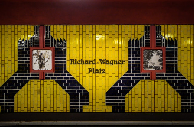
The typeface suggests Jugendstil, but the tiles suggest something else. The black and white images at this station are scenes from Wagner operas.
Understatement wasn’t on the design brief.
Industrial chic … or possibly the rough draft for a tripped-out level of Sonic the Hedgehog.
The pastoral scene on the platform is somewhat at odds with the giant Vattenfall cooling tower right outside this station.
Things calm down once again in the final section of the line between Rohrdamm and Rathaus Spandau (constructed 1982–84), which features functional faces in relatively sober settings.
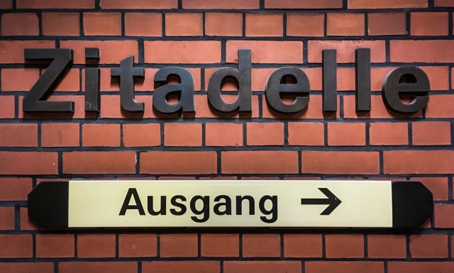
The ordinary red brick seems almost sedate.
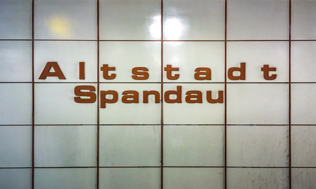
The word ‘Spandau’ is annoyingly off-centre.
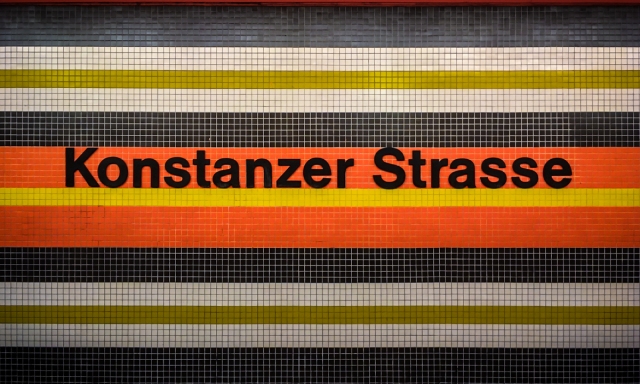
After reunification, the U2 and U6 returned to greater prominence within Berlin’s transit network and the U7, despite bringing passengers to within striking distance of the city’s two airports, has enjoyed a quarter-century on the relative periphery. Tastes have, of course, changed in the intervening years. The orange tiles at Konstanzer Straße may not look as cutting-edge as they once did, and it’s probably best to avoid Wilmersdorfer Straße if you happen to be on drugs; but for the most part the stations of the U7 have aged gracefully. The platform signs, which once achieved aesthetic greatness from their capacity to evoke a vision of the not-too-distant future, are no less pleasing now that they mostly recall the optimistic spirit of a time long past.
A long-time favourite.
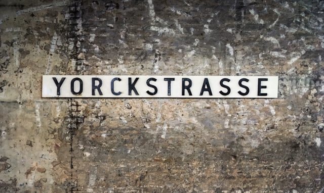
Nostalgia, however, is rarely factored into refurbishment plans, and there are a number of stations which have undergone (or are currently undergoing) life changing face-lifts. Halemweg and Bismarckstraße, have both been stripped to the concrete; Yorckstraße has lost its wonderful orange tiles; and one side of Adenauerplatz has suffered from the removal – temporary, one hopes – of its iconic giant-A panels. (If they ever go after Konstanzer Straße, this blog will be the first to organise sit-in protests).
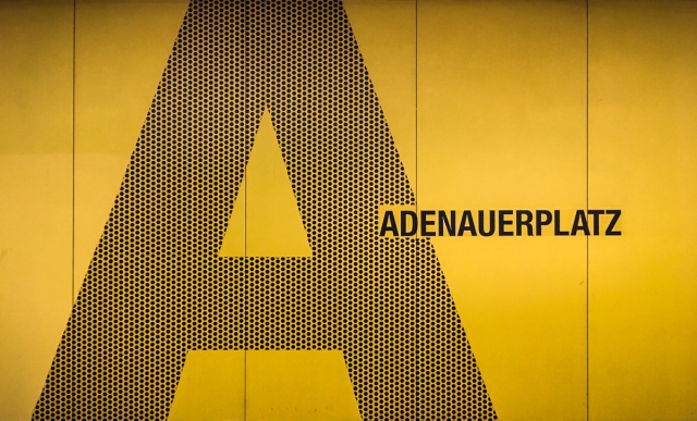
Adenauerplatz, eastbound platform.
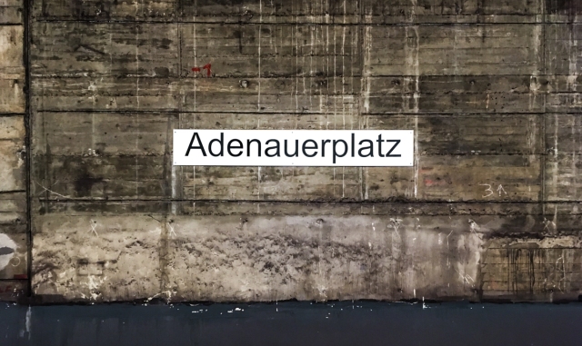
Adenauerplatz, westbound platform. Are the giant ‘A’s gone for good?
The orange tiles have been gone for a few months now. What will take their place?
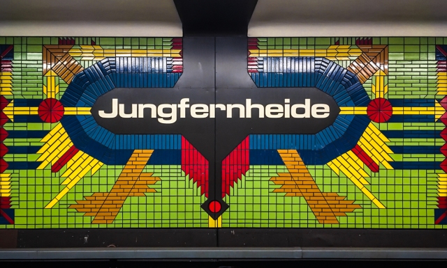
When old platform signage is removed, there is always something new to take its place. The new station names at Jakob-Kaiser-Platz, installed at the very end of 2016, seem almost too sedate after the psychedelia of Mierendorffplatz and Jungfernheide. The stainless steel letters on the hanging signs installed between the two sets of tracks at Mehringdamm aren’t wholly without aesthetic merit, but also feature some of the worst kerning that has ever appeared in any U-Bahn station.
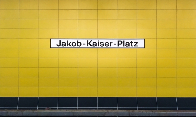
Some of the newest typography on the U7 is also some of the least exciting.
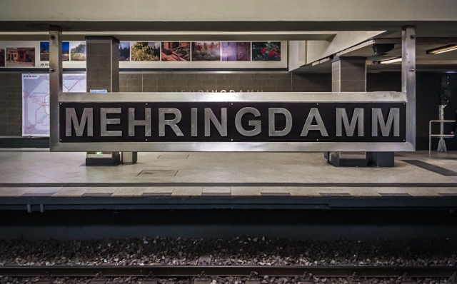
Looking for a parking spot? There’s one between the ‘D’ and the ‘A’.
The U7 is no more immune to change than any other aspect of urban life; indeed, the change has already begun. In six months there will be new platform signs at Bismarckstraße that may or may not be as nice as the now-vanished originals. In four years, the BVG may break ground on the proposed extension from Spandau to Staaken, opening a whole new chapter of platform signage. In twenty-five years, the U7 may have been partitioned and renumbered, and all our favourite stations renamed. We can’t predict the future, but we can appreciate the present … and the U7, perhaps more than any other U-Bahn line, deserves our appreciation.
Post Script
This post has focussed largely on the platforms for the simple reason that the external station structures – from simple staircases to whole buildings – tend to feature far greater typographic uniformity. But there are a few exceptions. Here are some of our favourites.
An old-school station sign. This stairway is currently under construction, which means that the sign will almost certainly be replaced.
A blast from the early twentieth century.
The futurist spirit of the U7 extension is on full display in this wonderful, now-counterless lightbox.
More exterior typography from the southern extension.
The many faces of… is an occasional series on the Berlin Typography blog which examines how stylistic diversity may arise within standardised urban systems. Previous posts have looked at S-Bahn Line S1 and Berlin’s Street Signs.
If you don’t already, you should follow us at @Berlin_Type on Twitter, for your daily dose of typographic goodness from Berlin.
Endnotes
Note 1.
Fun Fact: Because the old E Line was located in East Berlin, the BVG originally gave the number Five to a spur running from Deutsche Oper to Richard-Wagner-Platz. When the U7 superseded this line, the number five disappeared from West Berlin transit maps until reunification.
Note 2.
Another Fun Fact: Despite the division of the city, the BVG had built a hypothetical extension of what is now the U5 into their long term plan. The extension would have run from Alexanderplatz to Tegel, via Turmstraße, and would have featured cross-platform connections with the U7 at Jungfernheide. If you’ve ever wondered why each platform at Jungfernheide has a set of unused tracks, this is why.

Makes me want to go and ride the U7 right now.
LikeLiked by 2 people
“looking for a parking spot?” lovely.
LikeLiked by 2 people
Sehr, sehr geil!
LikeLiked by 1 person
Wonderful project!
LikeLiked by 1 person
Impressive review of the tiler’s art in the 80s. I really hope Adenauerplatz giant “A”s are re-instated. So stylish. The sulphurous tiles of Richard Wagner Platz are striking but that is one weird design. These blogs reflect the history of Berlin in a unique and imaginative way.
LikeLiked by 1 person
Fantastic post, wonderful. As one of my favourite modes of transport, I have always been a station name watcher.
Thanks for that.
LikeLiked by 1 person
Mit der bin ich früher täglich gefahren. Hab die Überschrift gelesen und dachte: was fürn Quatsch diesmal, da gibt’s doch nichts zu sehen. – wie ich mich doch getäuscht habe!! Sehr tolle Arbeit.
LikeLiked by 1 person
Hi. I have nominated you for a Mystery Blogger Award. Okoto Enigma @ okotoenigmasblog created the award to recognise the many amazing blogs out there. So, it ”is an award for amazing bloggers with ingenious posts. Their blog not only captivates; it inspires and motivates. They are one of the best out there, and they deserve every recognition they get. This award is also for bloggers who find fun and inspiration in blogging, and they do it with so much love and passion” (– Okoto Enigma). There is no obligation to take part, but if you wish to participate, please check out The Mystery Blogger Award nomination post on my blog. 🙂
LikeLiked by 1 person