

Berlin’s S-Bahn is nearly 150 years old, but it does a good job of hiding its age. Unlike the U-Bahn, which makes a virtue of its piecemeal construction, the S-Bahn suggests a more unified and standardised entity. Its old platform signs and station names have, for the most part, been replaced with a modern and highly functional system of signage which makes up for in efficiency whatever it may lack in quirky charm.
Yet the more time you spend on the S-Bahn, the more you become conscious of the intriguing variations within its apparent uniformity … and the more you begin to discover the small corners left untouched by time. These subtleties can be found throughout the network, but the line which offers the greatest breadth of typographic diversity is undoubtedly the S1.

The familiar white ‘S’ on a green background announces S-Bahn stations thoughout the city.
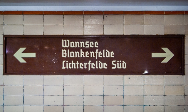
The S1, in its present form, runs from Wannsee in the far south-west to Frohnau, the city’s northernmost locality, passing underground only through the city centre. It shares its track at various points with the S2, the S7 and the S85, and in the course of its 38 km journey it calls at some thirty stations, ranging from the city’s busiest (Friedrichstraße, Gesundbrunnen) to its quietest (Hermsdorf). Some trains, after leaving Berlin, continue north to the town of Oranienburg.
At each of these stations one can find the familiar blue and white platform signs common to the entire network. But unlike the other lines, many of the S1 platforms also announce themselves in blackletter.

The southern terminus of the S1.
Although these signs may evoke a pre-Wall and pre-War Berlin to casual visitors, most are in fact quite recent. One can, of course, find historical examples: Brandenburger Tor station still has the old blackletter platform signs from when the station was called ‘Unter den Linden’. However at Potsdamer Platz and Nordbahnhof, new versions of the old-style signage are still being manufactured and used.
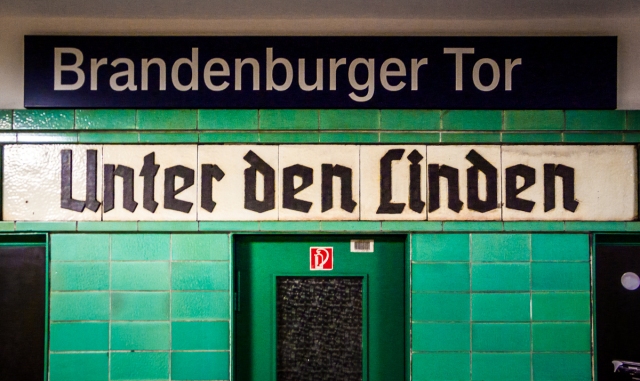
Unter den Linden in blackletter, with a standard blue and white platform sign above it bearing the current name of the station.

Enamel platform sign at Sundgauer Straße. Note the delightful Eszett.
In some cases, the use of blackletter has extended beyond the platform, becoming a defining feature of the whole station.

Beneath the blackletter characters one can still make out the remains of a previous sign. Note the s-t ligature (and the less-than-exemplary kerning at the beginning of ‘Berlin’).

The capital ‘Z’ is one of the most consistently fascinating characters in blackletter scripts.
Wayfinding signage on the concourse of Nordbahnhof.

Sundgauer Straße is one of the few all-blackletter stations on the S1. The letters here appear to be original.

The shiny new letters at Bornholmer Straße, on the other hand, are very much a recent development.
Of course, there is more than just blackletter to be found along the S1: the stations also offer an attractive assortment of sans-serif faces, both on and off the platform.

The ‘secret’ entrance to Bahnhof Schöneberg. Note the lovely terminal G.

This condensed face welcomes visitors to Wilhelmsruh.
Functional (but not inelegant) station sign at the northern end of the line.

The ‘new’ entrance to Botanischer Garten. The old station building just across the bridge, now a high-end cooking shop, features stone-carved letters.

There are still a few of these enamel platform signs at Nikolassee.
A few of the station buildings at the southern end of the line – Mexikoplatz and Nikolassee are the most obvious examples – were constructed not merely as entries to platforms, but as small commuter shopping areas with newsagents, bakeries and even a bar. Some of these stations feature a uniform house-style of typography all their own.

All the shops at Mexikoplatz, including the bar and the Steinecke bakery, share this Jugendstil-inspired face.

The old station letters at Wannsee have been restored quite recently to their former glory.
The typographic standards applied throughout the S-Bahn network are what allow it to function as an efficient and useful mode of transport for commuters, but it is the inconsistencies and variations that make it fascinating, offering intriguing insights into its history and evolution. The diverse typography found along the S1 should serve as reminder that true standardisation is a virtual impossibility … and if it did exist, it would make the practice of our daily lives considerably less interesting.
The many faces of… is an occasional series on the Berlin Typography blog which examines how stylistic diversity may arise within standardised urban systems.
And if you don’t already, you should follow us at @Berlin_Type on Twitter, for your daily dose of typographic goodness from Berlin.

Oh how delightful! And interesting to know how the black-letter signs are still being made for these uses.
LikeLiked by 1 person
Fantastic post with mounds of information! My favourite would have to be the “Zum Bahnsteig“ from the Sundgauer Strasse, wonderful.
Thank you for another great post.
LikeLiked by 1 person
Berlin, du bist so wünderbar Berlin 🙂
LikeLike
like like like 🙂
LikeLike
I love every element of the type that’s used in these stations, but even more so, for similar urban-rail systems around the world.
LikeLiked by 1 person