

The primary function of any city is to provide its citizens with the necessary ingredients for daily life: food, shelter, a source of income, a variety of entertainments, differing levels of companionship, and, with any luck, a stable Wi-Fi connection. But a good city is also the guardian of its own history, and while tending to the needs of the present it also works toward preserving the essence of its past. Typography, unsurprisingly, plays a sizable role in making that past accessible to the city’s modern occupants.
The presentation of history within the urban environment is often subtle — but it is everywhere. In Berlin, we find it in the street signs, which commemorate not only the artists and statesmen who shaped German culture, but also the historical figures who made their mark on the city at a more local level; we find it also in the numerous monuments marking significant events in the life of Berlin (of which, in the past century, there has been no shortage). Yet if we want a more intimate understanding of the place where grand history and quotidian existence intersect, we can do worse than to look out for the plaques on residential buildings.
Most cities have an official marker for people of note who have lived in a particular building, and Berlin is no exception.
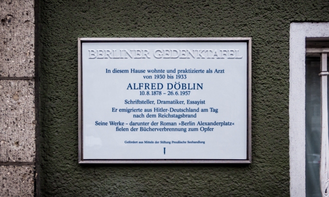
The standard Berliner Gedenktafel, this one in honour of doctor and novelist Alfred Döblin, author of Berlin Alexanderplatz.
The blue-on-white Berliner Gedenktafel – made of porcelain and manufactured by Berlin’s own Königlichen Porzellan-Manufaktur – were introduced in 1985 and have since spread throughout the city. The building in Schöneberg where David Bowie lived in the 1970s is one of the most high-profile new additions in recent years.
However the desire to commemorate the dwellings of notable residents is almost as old as the city itself, and a large number of different plaques have accumulated over time. Some of those plaques were placed by the city, but many others came about through the efforts of private societies. As a result, the city’s commemorative markers contain a wealth of diversity in both material and content. Some are cast in bronze, others carved in stone; some are brief, offering little more than names and dates, while several make a case for the significance of their commemorands.
The plaques have a way of humanising the great figures who were born, lived, and sometimes died in these ordinary buildings; the city, for all it has changed in the past century, may not yet be wholly unrecognisable to the notables who once called these streets home. At the same time, the plaques offer a reminder that our own lives are part of something greater, and that our daily struggles may one day be looked on with reverence by the Berliners of the future. Inspiration, after all, must also be counted among the essential ingredients of everyday life.
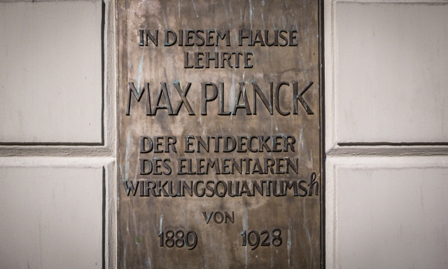
Nobel Prize winning physicist Max Planck is a legendary figure … yet the plaque reminds us that he was once a real person who gave actual lectures in this building on Unter den Linden.
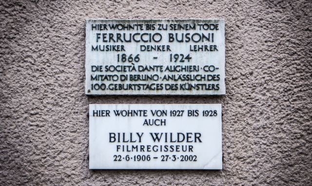
The composer of Doktor Faust and the director of Sunset Boulevard, together for the first time. Sadly their tenures in this Schöneberg building didn’t overlap.
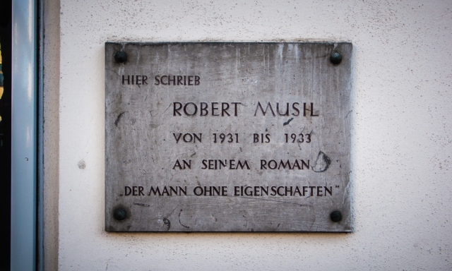
Strange to think that a part of one of the twentieth century’s most quintessentially Viennese novels written just off the Ku’Damm.
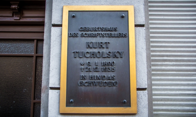
Kurt Tucholsky’s birthplace in Moabit. Thirty years later, the great Berlin satirist would turn up in Friedenau (see below).
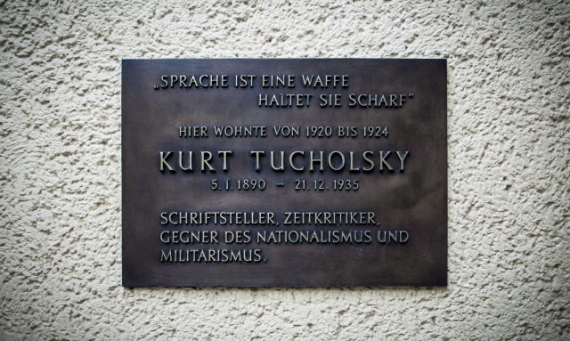
Tucholsky was important enough to merit several plaques (and, of course, a street in Mitte). The makers of this plaque were apparently unsure of his correct birthdate.
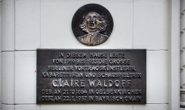
Great singer and cabaret performer Claire Waldoff lived just up the road from Busoni and WIlder in Schöneberg.
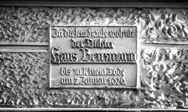
This fraktur plaque in honour of Hans Benzmann was placed on the front of his Steglitz house in 1927, only a year after his death.
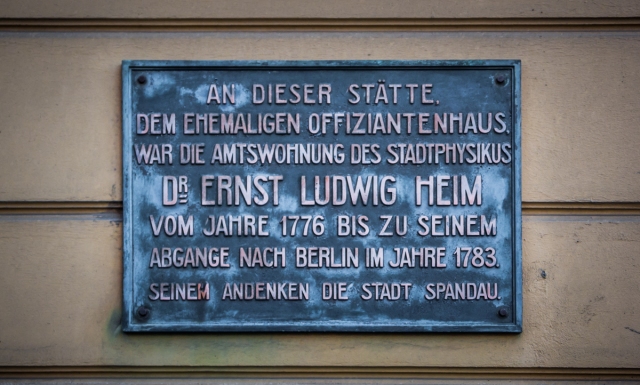
Ernst Ludwig Heim lived and worked in Spandau for seven years before relocating to Berlin’s Gendarmenmarkt.
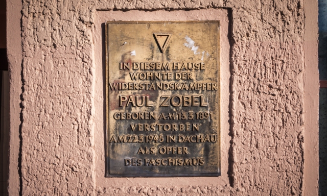
There are, of course, a considerable number of markers for Berliners who gave their lives in the fight against National Socialism.
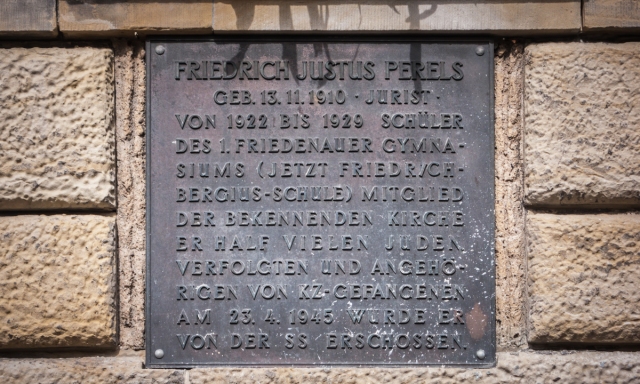
This plaque appears on the side of the school where jurist Friedrich Perels studied as a youth. The adjoining square was renamed Perelsplatz in his memory.
Cities and Memory is an occasional series on the Berlin Typography blog which examines how the city uses text to preserve and present the layers of its own past.
If you don’t already, you should follow us at @Berlin_Type on Twitter, for your daily dose of typographic goodness from Berlin.

The only such plaque I knew of was the one marking the spot where John F. Kennedy spoke. I have a photo of it somewhere, taken with a lousy 110 camera. I’m glad to know there are more of these plaques. I wish we’d do the same kind of thing here in the US.
LikeLiked by 1 person
As usual, thank you for a great post. Your eye for detail goes beyond that of mere mortals but through your eyes we see the detail.
LikeLiked by 1 person